Below are a few exercises that I did in early 2019 to better acquaint myself with different ways that I can use type compositionally. For many of these exercises, I tried to focus on a specific principle of design such as the relationship between positive and negative space, movement, and balance among others.


typography in action
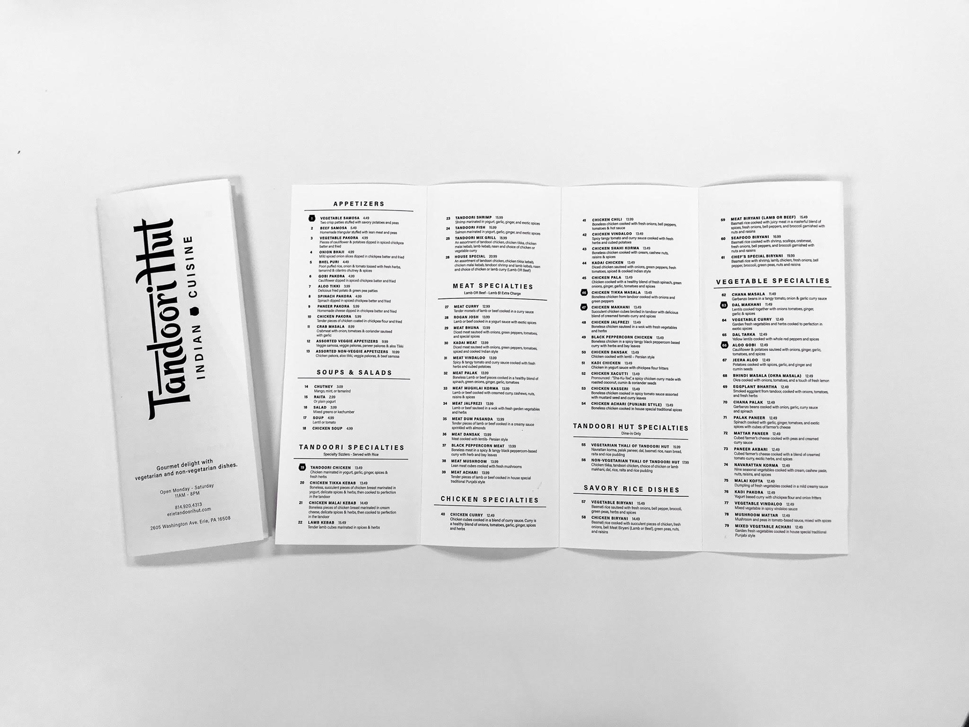

The first image above is of a menu design I worked on with over 130 menu items needed on it. Each menu item included an identifying number, a price, and a description - that's a lot of text to manage! While it took a lot of time and effort, I really enjoyed this particular project because it challenged my attention to detail. I worked hard to keep the spacing between items and sections even, keeping everything readable, organized, and easy to navigate. The other two images are of recent catalog design projects. The company's industry standard for the text was left justified. With each of the catalog projects ending up being 200+ pages, the type management requires a careful eye to catch all of the line breaks.
formal typography poster

This poster was designed in January of 2020 and it was based on an article about "idearists." The article, which is featured in the poster, describes idearists as risk-takers, rule-breakers, experimentalists, askers of difficult questions, and so on. Taking that description, I let it inspire the way that I formatted the type. With idearists being the center of attention within the article, I made it the center of attention in the poster. I orientated the letters in different ways, played with capitalizations, and letter substitutions to make the word as visually appealing as it could be while still being readable. The article is written out underneath the focal point aligning with the visual edge of the word. Additionally, the quote that goes along with the article is spotlighted by the question mark's directionality.
the gum project
The objective of this project was to create a promotional collection for fonts. The chosen subject for this project was chewing gum brands. The process started by researching facts about each of the six gum brands and finding a font that corresponds with each fact in some way. On the back cover of each gum package there is a detailed explanation of the font’s connection to the gum brand.
For the front of the packaging the logo was replaced with the font chosen and the outside of each gum wrapper documents the evolution of the gum brand’s logos. On the inside of the wrappers, there is a fun fact about chewing gum. Finally, on the inside flap of each gum package there is a small explanation about what all the information is and why the logo is different. All of the text on the gum packaging aside from the logo is done in Helvetica because the font’s simplicity makes it look successful when matched with any of the chosen logo fonts.

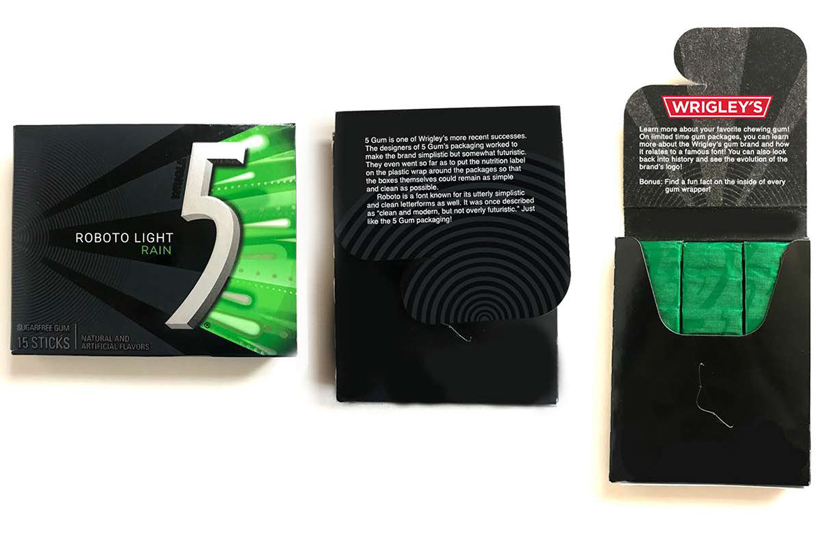
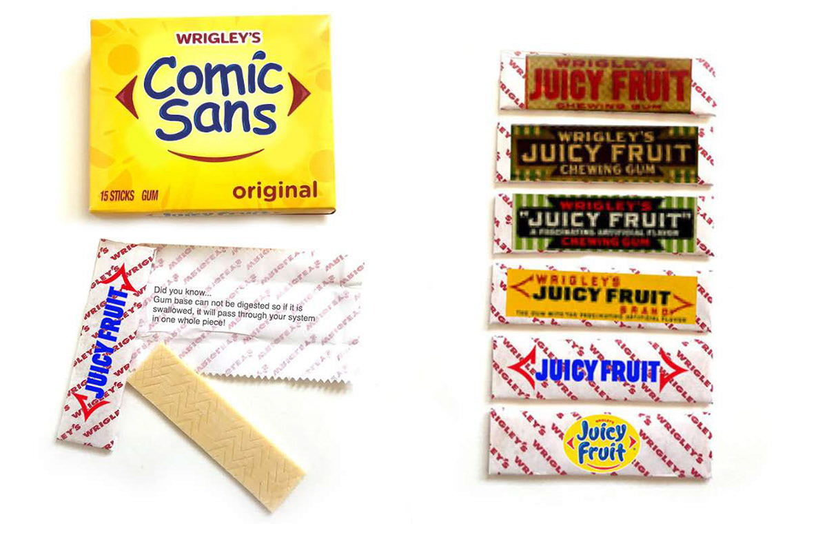

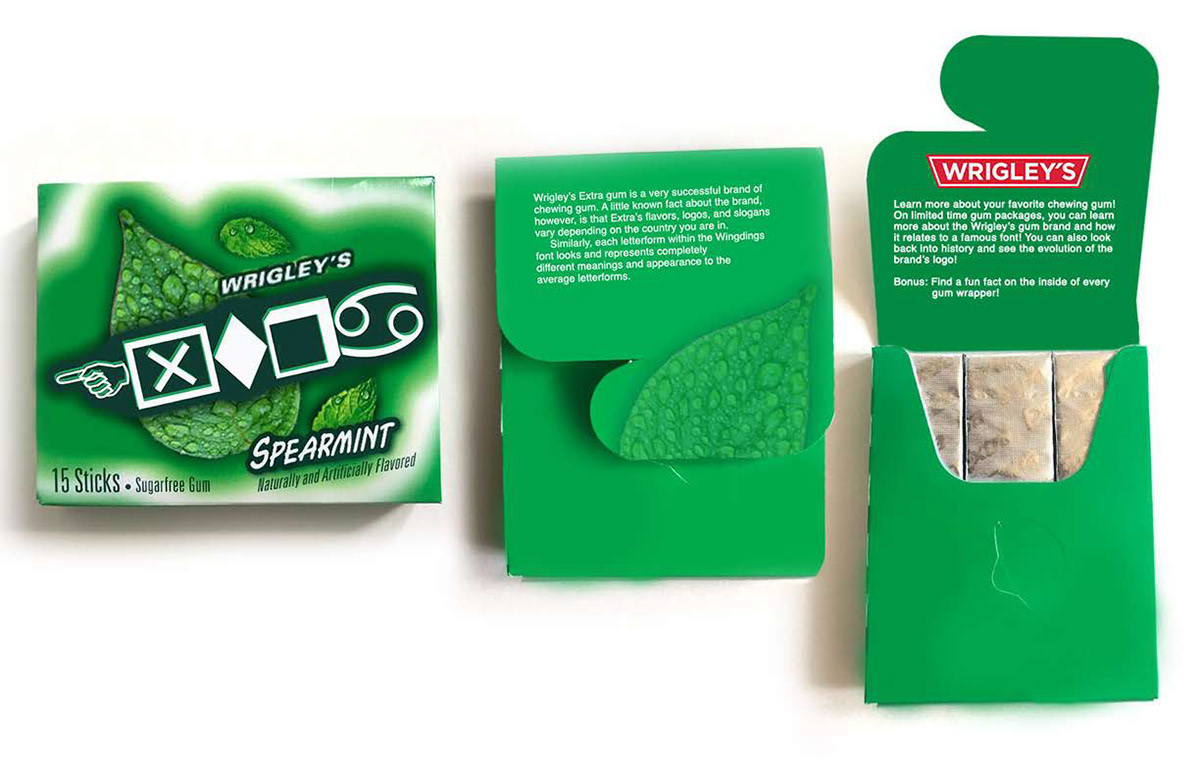
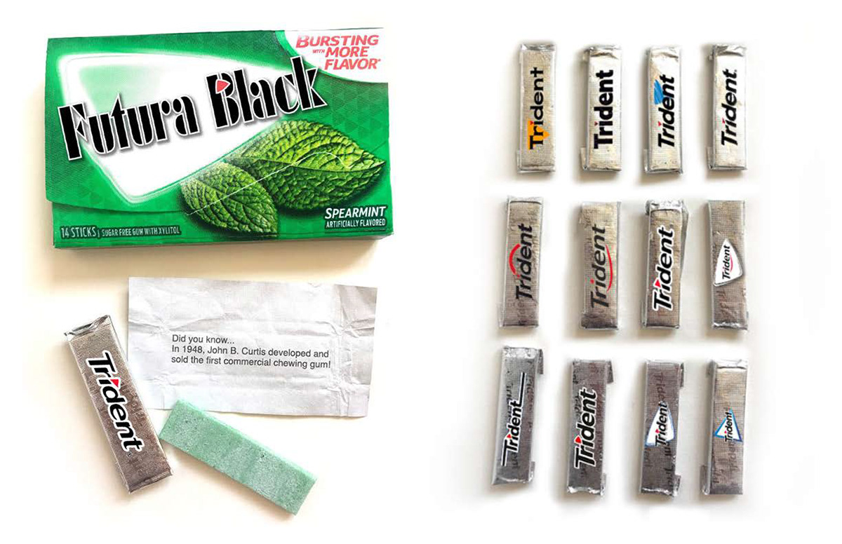
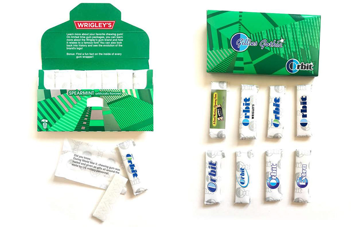

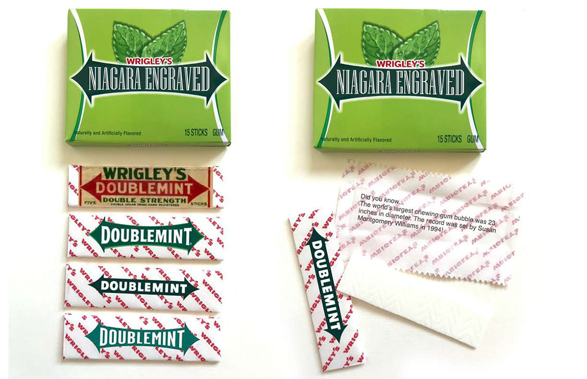
To briefly summarize each reasoning for matching the fonts with the gum, the font Gillies Gothic corresponds with Orbit gum because Orbit was created in response to WWII and Gillies Gothic was popularly used in WWII posters. Trident gum was matched with Futura Black because each are famously used by NASA. 5 Gum and Roboto are connected because of their modern simplicity, and Juicy Fruit was coordinated with Comic Sans for their common target demographic. Wingdings were used for Extra gum because Extra’s branding and flavors are unrecognizably different in every country just like Wingdings make words unreadable. Finally, Doublemint gum was matched with Niagara Engraved because Doublemint’s advertisements have always used twins just as Niagara Engraved appears to have a double stroke in every letterform.
hand painted lettering
In 2017 I was commissioned to hand-paint typography onto pumpkins for a wedding reception. I am featuring this project to show how long I have loved typography and that I am able execute good typography by hand.