iconography

This travel icon set was designed by me in the Spring of 2019. The goal of the project was to design a cohesive set of icons that could be viewed at any size and had a clear connection between them. Personally, I am a huge fan of travelling so I decided to base my icon set around that. The simplistic line design of these icons matches my overall design style as I often gravitate towards minimalism and a limited color palette. To make the icons more cohesive than in just the style they were done in, I also designed them to each be in the same front-facing perspective.
style matching capabilities
Style matching is a skill that comes in handy frequently as a designer. I found myself really mastering this when I worked in a signage shop. It has more of an agency-feel as there is work that comes in from many different brands. As a graphic designer, it is my job to observe and match whatever style is asked of me.
This project was done in the Summer of 2020 while I worked as a graphic designer for FASTSIGNS in Erie, PA. It was an especially fun challenge for me and my style-matching capabilities. The left window panel is what already existed. The right window panel had been cracked so this business got a replacement and needed the design continuation to be recreated. I was able to design what is shown on the right window panel from scratch to match. The other part of the challenge was getting the correct proportions and measurements so everything would line up evenly.

athletics promotions
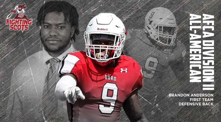


Above are some examples of work that I did in my two years of working for the Edinboro University athletic department. My job was primarily to design the covers of the programs that went out at the home games for each sport at Edinboro. Additionally, I was asked to edit all of the pictures taken of the athletes for various uses and I would design some web graphics.
invitation design

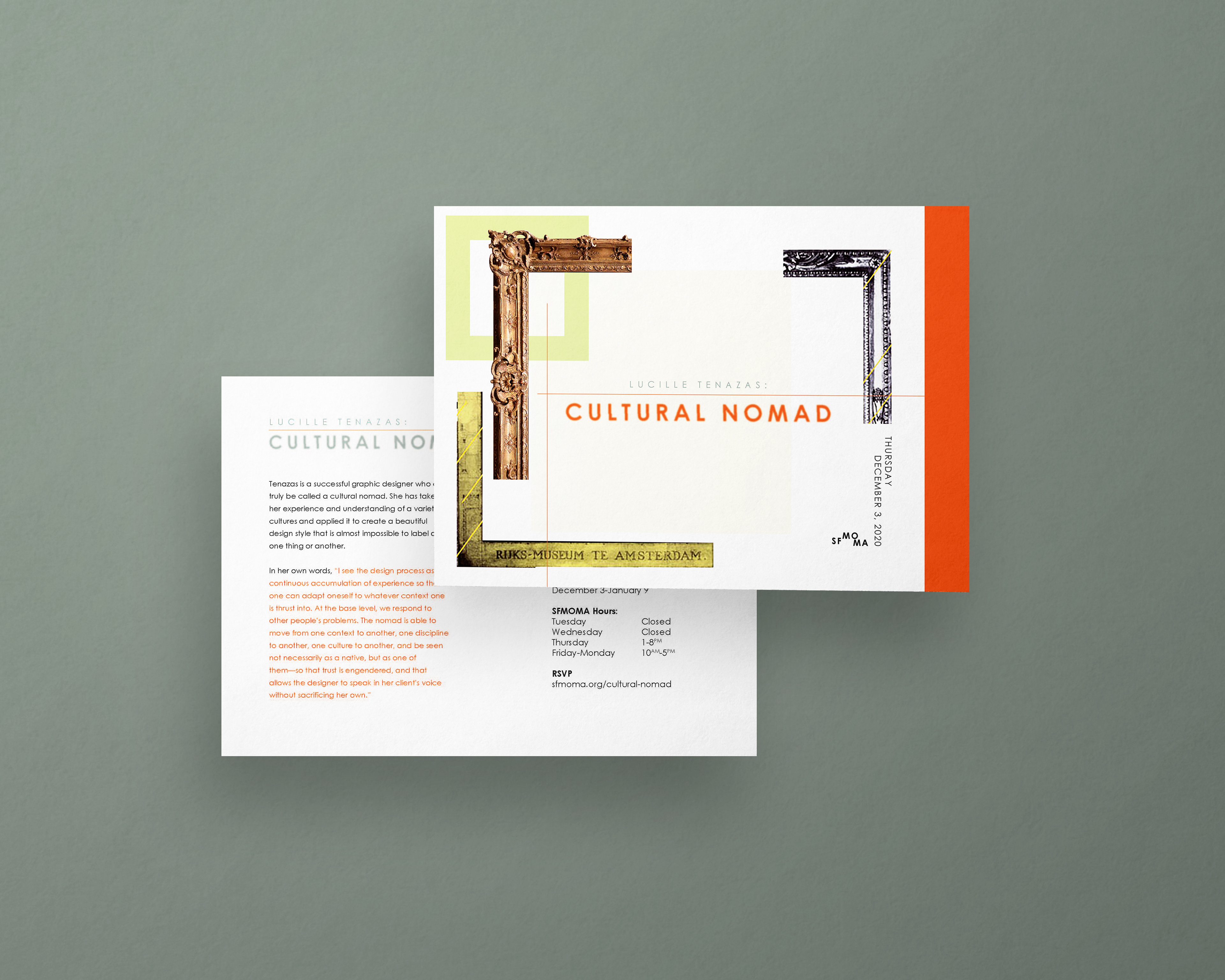


The objective of this project was to research an artist for The People’s Graphic Design Archive to recognize and appreciate artists who have historically been underrepresented in the industry. Lucille Tenazas lives and works by the policy of being a cultural nomad. She believes that being a designer with a strong voice means being able to experience and apply other cultures to designs. Because of this concept, this invitation for an exhibition of Tenazas’ work is based around being a cultural nomad. It felt conceptually appropriate to create a postcard series rather than a traditional invitation. The typeface Century Gothic is used because while the font has a strong structure, it also has organic curves which reflects the way Lucille Tenazas designs. Also included are parts of Tenazas’ own works to give a kind of preview of what may be included in the exhibition and offering examples of Tenazas’ voice as a cultural nomad.
poster design
Find the rationales below.
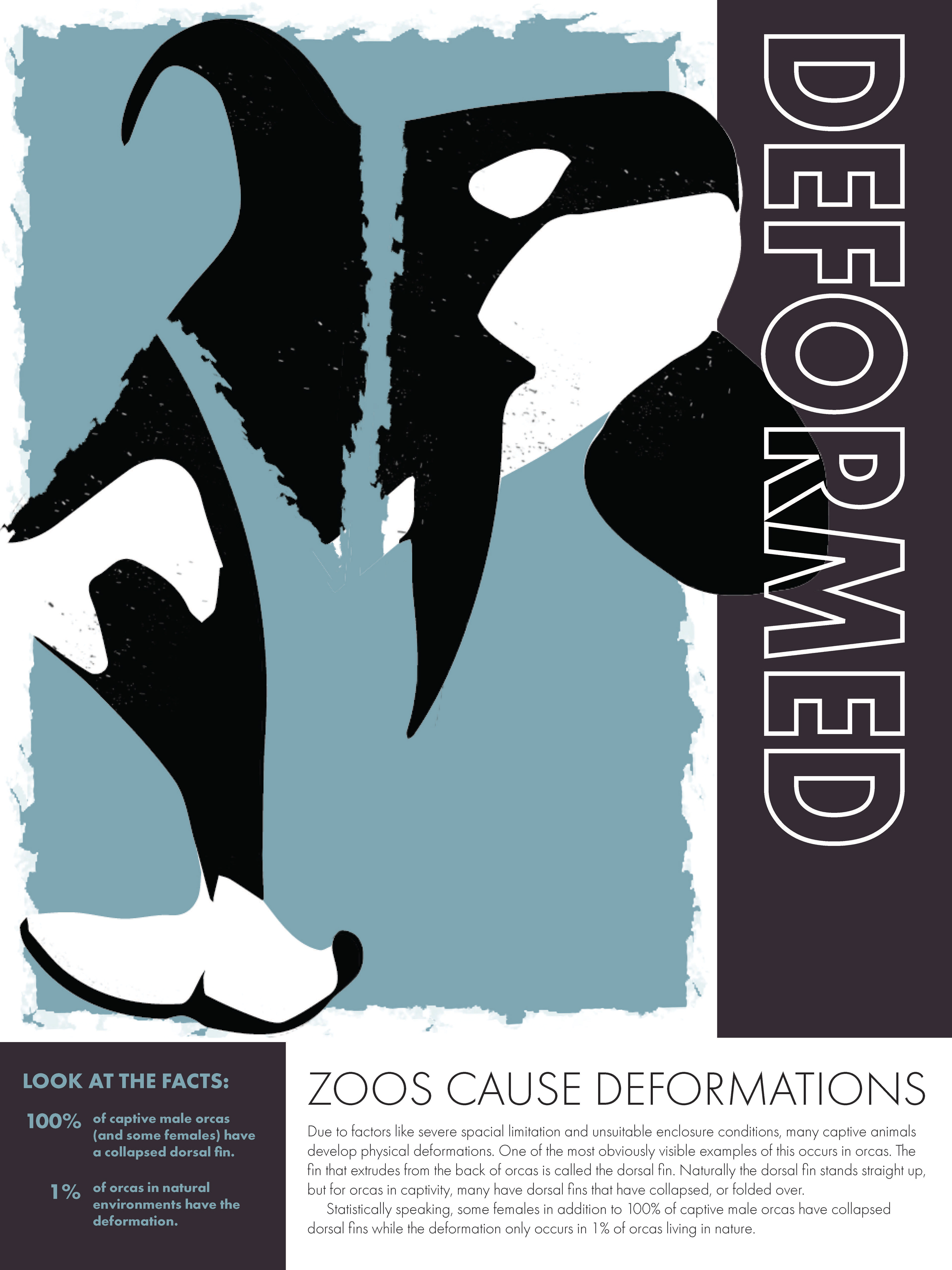
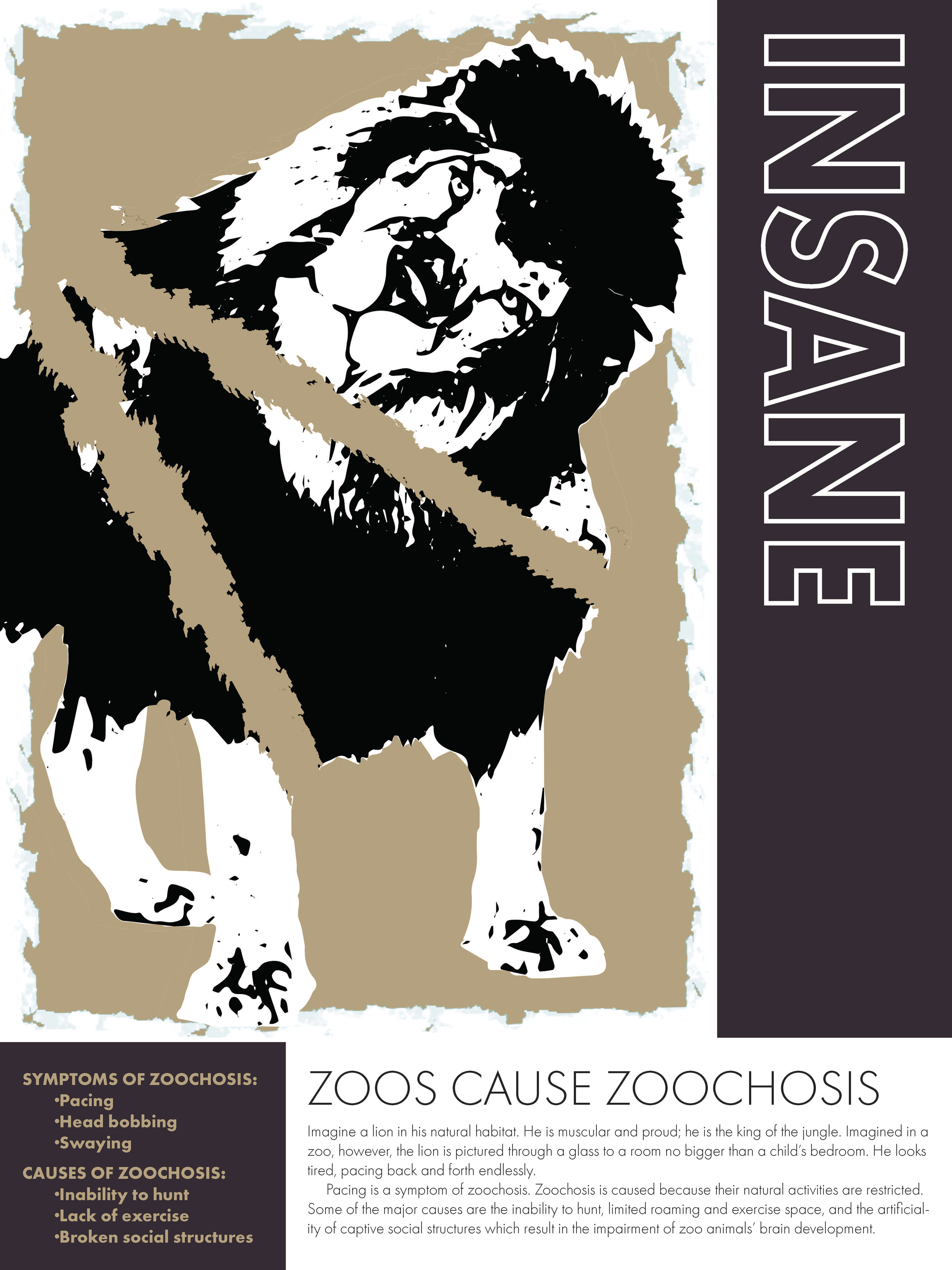
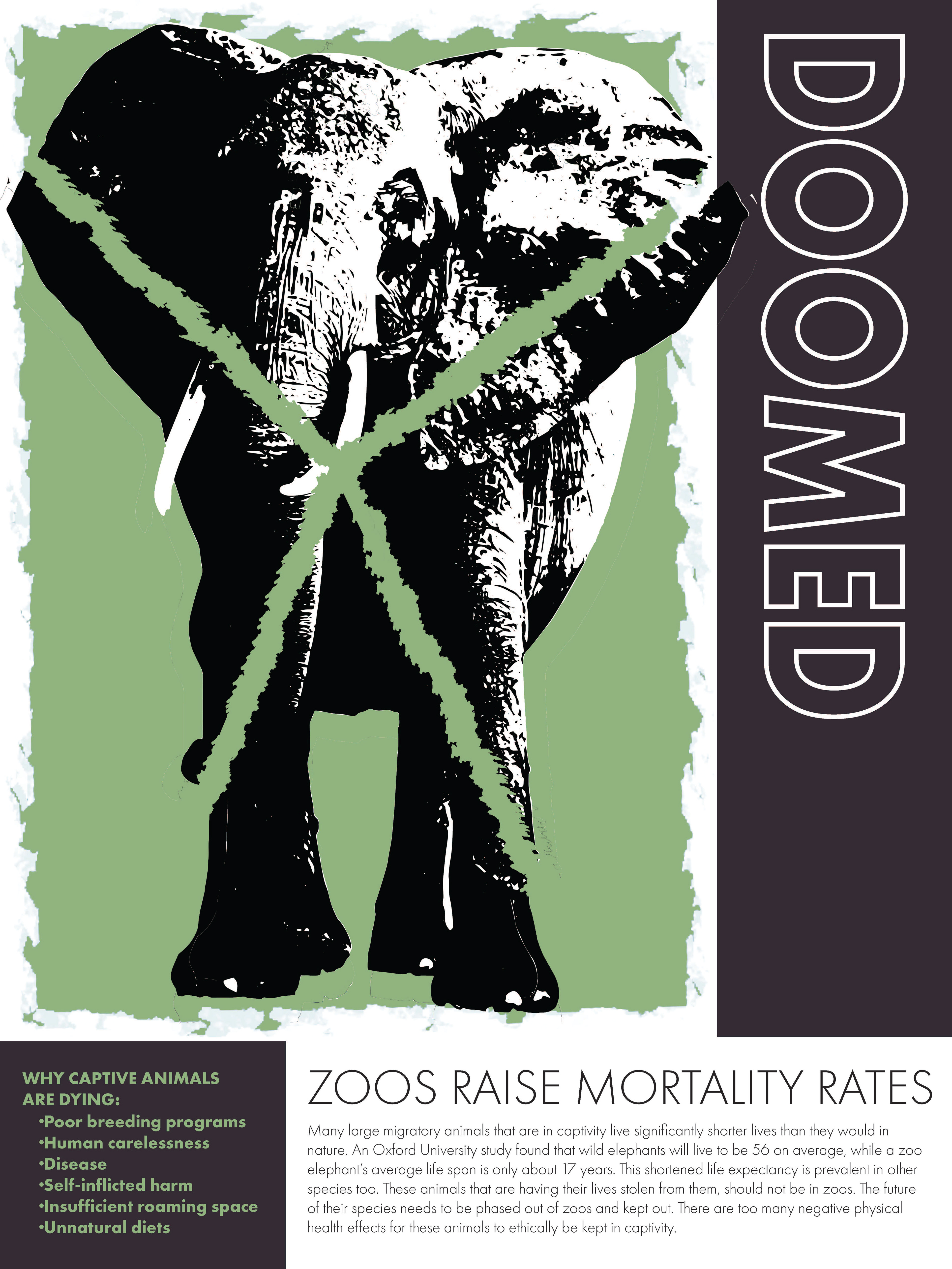


Zoo Poster Series
Note: This poster series was featured in the 19th Annual Chimera Exhibition in Bruce Gallery. Additionally, it was featured in the Chimera XIX: A Progression of Clarity publication.
This project consisted of four posters that employed post-modern design practices, specifically pastiche and deconstruction. The concept was to enlighten and educate viewers about the harmful effects that zoos have on their animals. Pastiche was used in a détournement fashion by using a zoo advertisement and flipping its purpose to make it an advertisement against zoos. The post-modern technique of deconstruction was employed in the imagery of the posters. Each poster emphasized a different animal, but each animal was deconstructed to support the topic of the specific poster. For example, on the poster focusing on zoochosis, the lion’s head was flipped to illustrate insanity. On the poster about physical deformations, an orca’s tail is detached and flipped demonstrating a deformity. The polar bear’s image was enlarged to highlight the spacial limit, and finally the elephant was cut into with an “X” to represent its imminent doom ultimately caused by captivity.
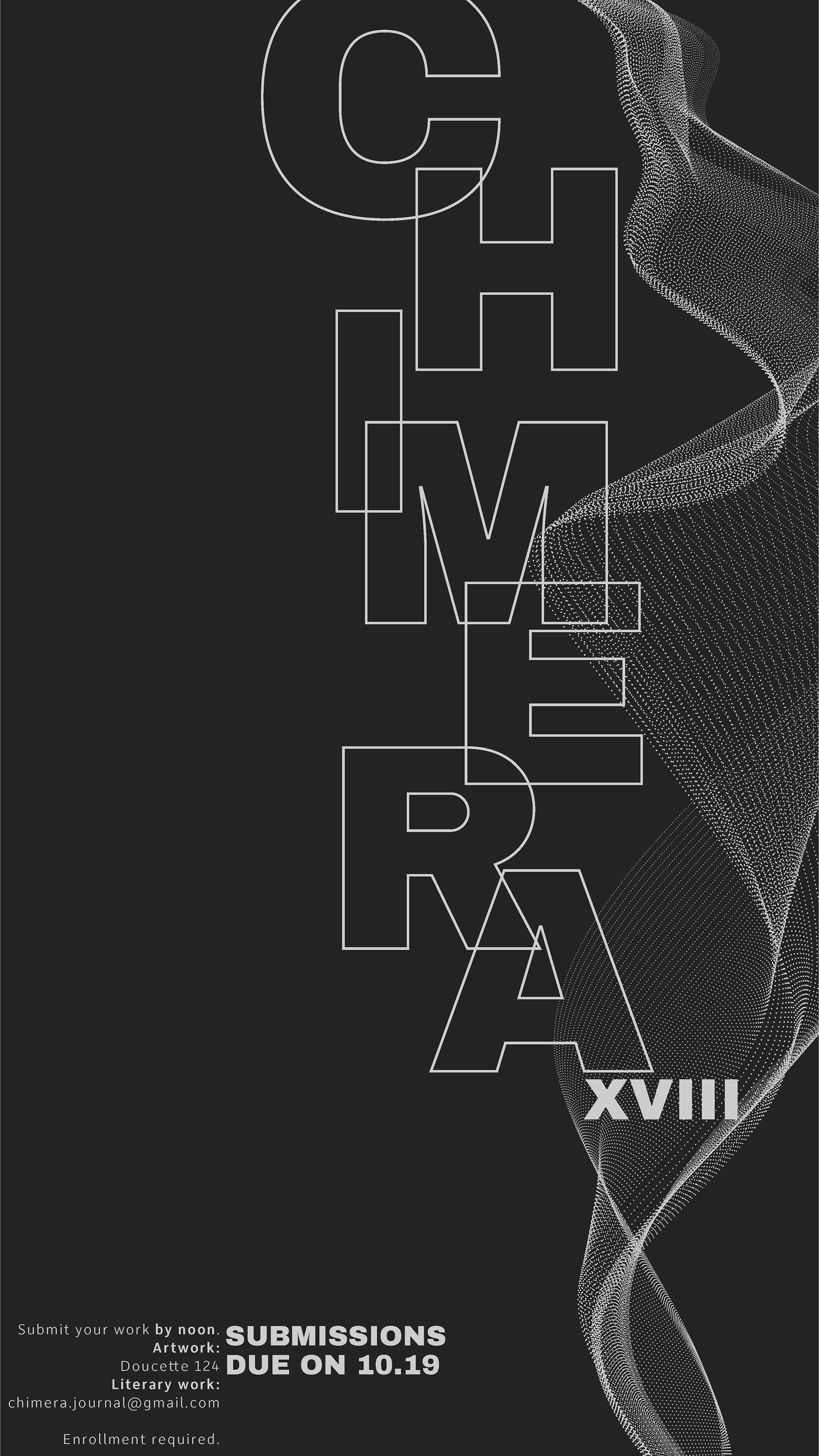
Chimera Poster
Chimera is an annual student-run publication at Edinboro University. The zine is a collection of artwork (2D, 3D, animations, etc.) and literature all created by students of Edinboro. The full zine is also designed by students and the artwork is voted on by the students as well. I was personally a contributing member of Chimera for two years. This poster to the left was done in my first year as a member of the promotional team for the XVIII edition. In my second year of Chimera I was given the privilege of being the managing director of the XIX edition.
To reiterate, the poster to the left is a promotional poster done in the Fall of 2020 for the student-run annual zine. The concept behind this poster was minimal with a touch of surrealism or dystopian-like elements.
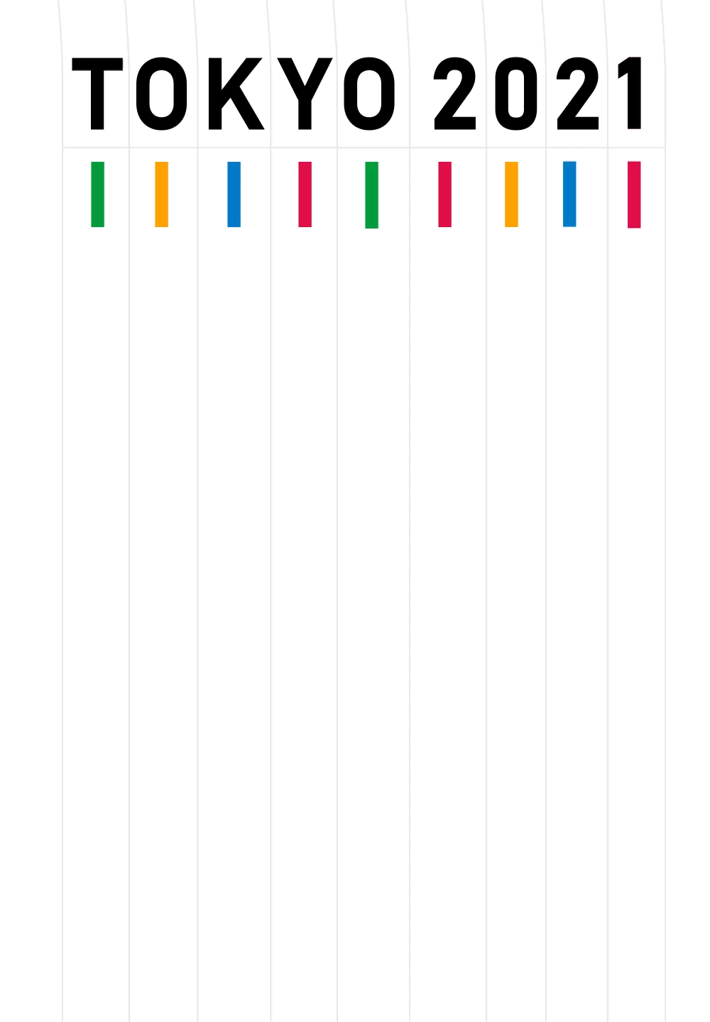
Olympics "Moster"
The objective of this project was to design a poster for an upcoming event that includes motion. The event advertised in this moster (motion poster) is The Olympic Games which was rescheduled from the summer of 2020 to the summer of 2021. The games will be held in Tokyo, Japan. The inspiration for this formal design was loosely based on the Japanese writing format with vertical lines. That concept was paired with the competition that comes from The Olympics to create this vertical race track design. The colors that were used matched the pantones of the Olympic rings and the font used, Bahnschrift, matches the font used in the original Olympic logo used for the Tokyo games. With all things carefully thought out, this motion poster is meant to portray the competition, athleticism, and patriotism that comes hand-in-hand with The Olympic Games.
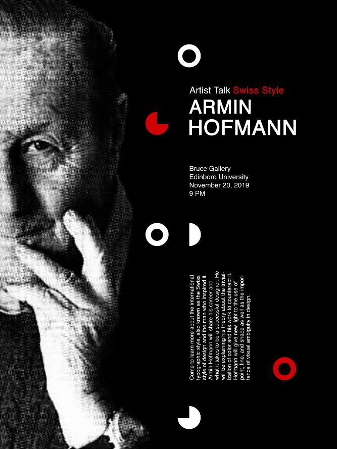
Armin Hofmann Poster
The poster to the left was designed in the Spring of 2020. The project was to research an influential graphic designer from recent history and create a promotional poster that reflects that designers style. Armin Hofmann was a leading designer in the Swiss Style. I am a big fan of Hofmann's style because I can strongly relate to his limited and selective use of color. He also worked with high contrast images many times that would blend into his design in a very visually interesting way. Some other design techniques of his that I employed was his use of the grid, and the geometry of simple shapes to draw attention to important areas.
Idearist Typographic Poster
This poster was designed in January of 2020 and it was based on an article about "idearists." The article, which is featured in the poster, describes idearists as risk-takers, rule-breakers, experimentalists, askers of difficult questions, and so on. Taking that description, I let it inspire the way that I formatted the type. With idearists being the center of attention within the article, I made it the center of attention in the poster. I orientated the letters in different ways, played with capitalizations, and letter substitutions to make the word as visually appealing as it could be while still being readable. The article is written out underneath the focal point aligning with the visual edge of the word. Additionally, the quote that goes along with the article is spotlighted by the question mark's directionality.