tandoori hut rebranding
AWARD WINNER
Click HERE to read an article written about this project.
Tandoori Hut is a restaurant located in Erie, PA. I was able to work on this project through the NWPA Innovation Beehive Network along with designer Hannah Florentine.
The goal of this project was to create a successful new brand for Tandoori Hut including a new logo, business cards, and menu. The restaurant prides itself on its fresh, flavorful, and authentic Indian cuisine, so the new branding needed to match and emphasize that.
This branding project won silver in the Branding/Re-branding category of the NWPA PRSA 2022 Niagara Awards.


The logo was created using a customized version of the font Tangak. It was modified to resemble Nepali writing that features a connecting crossbar over the characters. The subtext, “Indian Cuisine” is in the font Acumin Variable Concept which is simplistic enough that it does not detract from the heavily stylized primary font. Finally, the logo includes the authentic shape of a tandoor oven which is commonly used for cooking Indian cuisine.
Above, there are images showing some of my process work. For logo design I always start with research (not shown here) and thumbnails and build from there. The logo for this project went through many rounds of critique to get to the final. The critiques were primarily from advisors Cass Reese and Scott Gladd along with some other designers. There were two client presentations of the logo development before the final logo was approved.
Other deliverables for this project included business cards for the restaurant owner and a new menu.

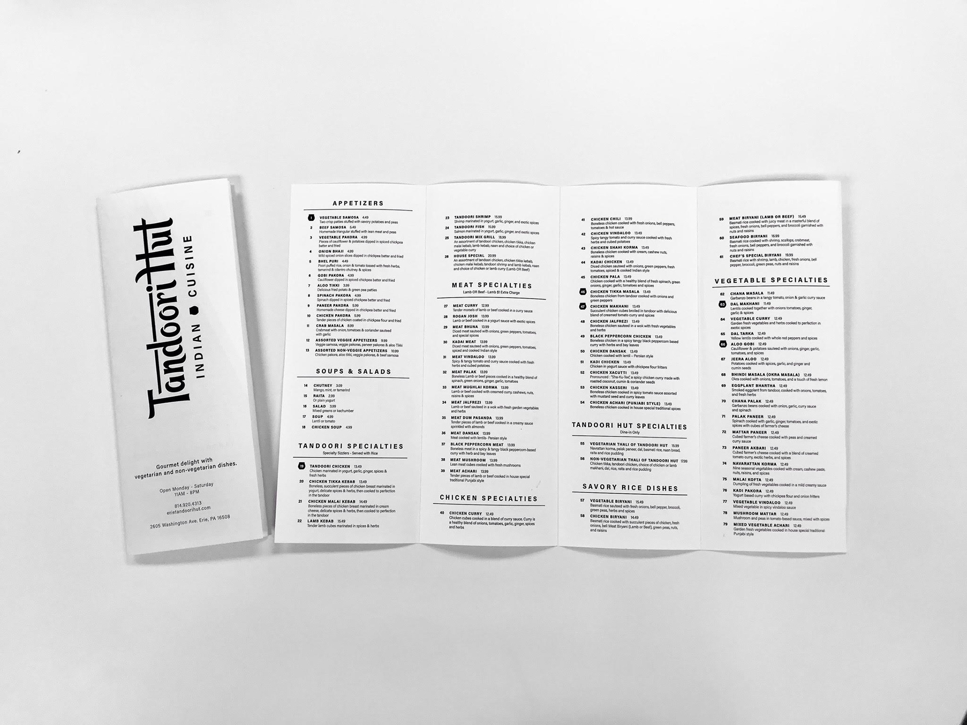


The business card utilizes both sides and features the tandoor icon reflected on each side. The red color emphasizes two of the client’s key words: hot and spicy. The type treatment on the business cards and menu is derived from the treatment of the subtext in the logo with the primary focus of readability.
The menu for Tandoori Hut is extremely content heavy including 131 menu items, so the spacing and readability was vital. The menu was further simplified due to the printing limitations of the restaurant as they could only print black and white. The cover of the menu shows the logo prominently with the necessary information at the bottom. In the background of the cover is a subtle gradient to bring in some personality and heat to the menu.
The project above was completed between August - December of 2021.
myPI campaign branding
AWARD WINNER
MyPI is a campaign launched by our client, Presque Isle Partnership, to get locals out of the house and doing activities at Presque Isle State Park in Erie, PA. This campaign was launched in the Spring of 2021 to celebrate the 100th anniversary of Presque Isle being a state park. COVID-19 was also prevalent at this time so everyone craved fresh air and a way to be active. I was able to work on this project through the NWPA Innovation Beehive Network with designers Robert Campbell, Karlin Hiles, and Kain Winecke.
The task of creating this campaign came with multiple deliverables including naming the campaign, creating the logo, and making a motion graphic to explain the concept of the campaign to the public.
The explainer video won gold in the Video News Release/Marketing Video category of the PRSA 2021 Niagara Awards.


To start, the MyPI logo features a customized block font for “PI” to better emphasize the counter of the P which is shaped as Presque Isle State Park itself. Since the goal of this project was to better connect visitors with the park and motivate them to be more active via their individually set challenges, the “my” of the logo is hand-written to highlight the personal aspect.
The research for this project essentially started as far back in my life as I can remember. I was born and raised in Erie, PA and had never lived farther than 15 minutes away from Presque Isle State Park. My family, my dogs and I are regulars at the park so I have always been very well informed about the park which is what made this project so special to me. My thumbnails for this project heavily featured the shape of the state park because the Partnership's board had mentioned that they would be interested in using that visual since it is so recognizable to locals. With plenty of critiques, revisions, and presentations, the logo was approved and strong.
The other deliverable for this project was a motion graphic explainer video.
The motion graphic portion of this project utilizes a pseudo-realistic style to connect the challenge to reality while maintaining relatability for the wide range of viewers and participants. The process was highly collaborative between the client, advisors, design team and so on all the way from the script to the final product. The client, which included a board of members, offered a variety of critique and feedback which allowed experience for the design team to understand the intricacy of interpreting feedback and keeping the largest portion of the client-body satisfied while maintaining the design’s integrity. The voice over (my voice) is intended to be motivational and inviting to encourage potential participants. Finally, the color choices featured in both, the motion graphic and the logo heavily relate to the state park and its environment.
This project was regionally significant as the client, Presque Isle Partnership, does so much to maintain and better the park and its visitors. You can visit Presque Isle Partnership's website and see the guidelines of the campaign (which technically concluded in May 2022) further outlined.
This project was completed between January and May of 2021.
more identity design projects
Find the rationales for each project below.


The projects you see above were completed between March 2021 - March 2022.
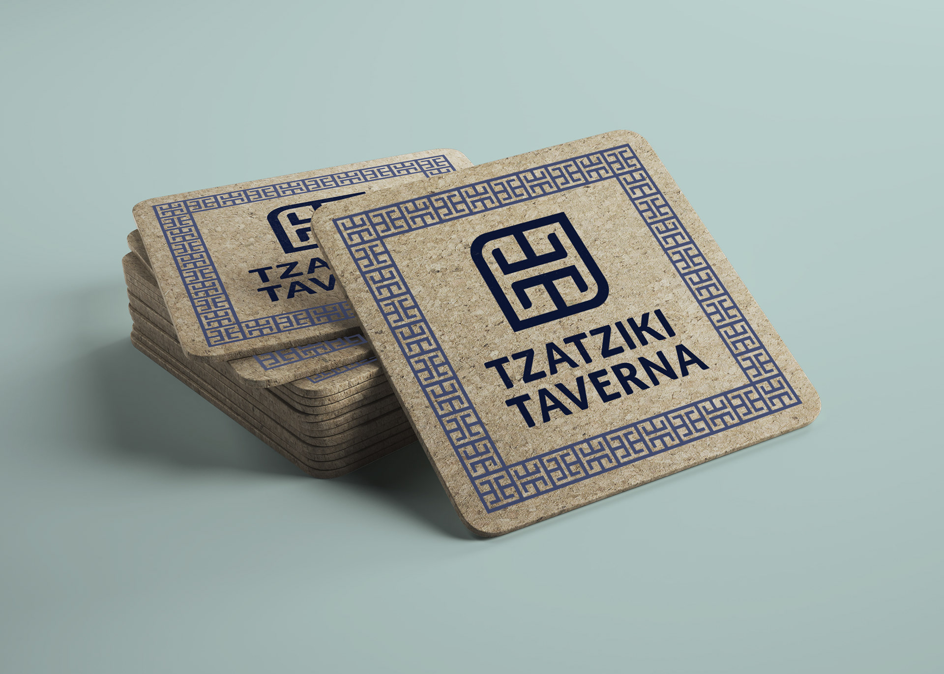
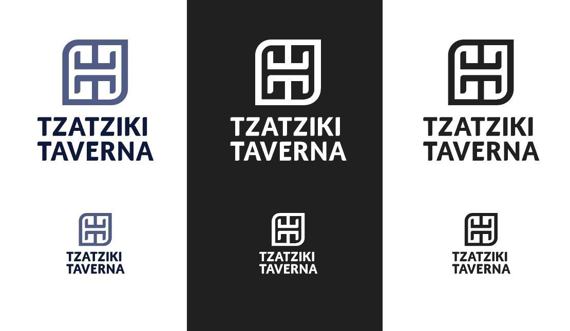
Tzatziki Taverna
The objective of this project was to create a name and brand system for a fictitious, locally-sourced, organic restaurant. The restaurant specifically specializes in locally-sourced Greek foods and customer involvement in terms of visibility of ingredients and cooking processes within the restaurant. The logo is intended to reflect a Greek pattern and additionally features the initials of the restaurant, “TT” for Tzatziki Taverna. The partially rounded edges of the logo mark bring in the organic tone to the logo. The type used in the logo is a modified version of Lato. More of the character’s edges are rounded in order to better relate with the mark. Lato was chosen overall because of its already existing rounded corners. The simplicity of the font helps to avoid cliché Greek styles and better matches the simplicity and structure of the logo mark. Since blue is such a prevalent color in Greece, it was fitting to use in the logo of the Greek restaurant.
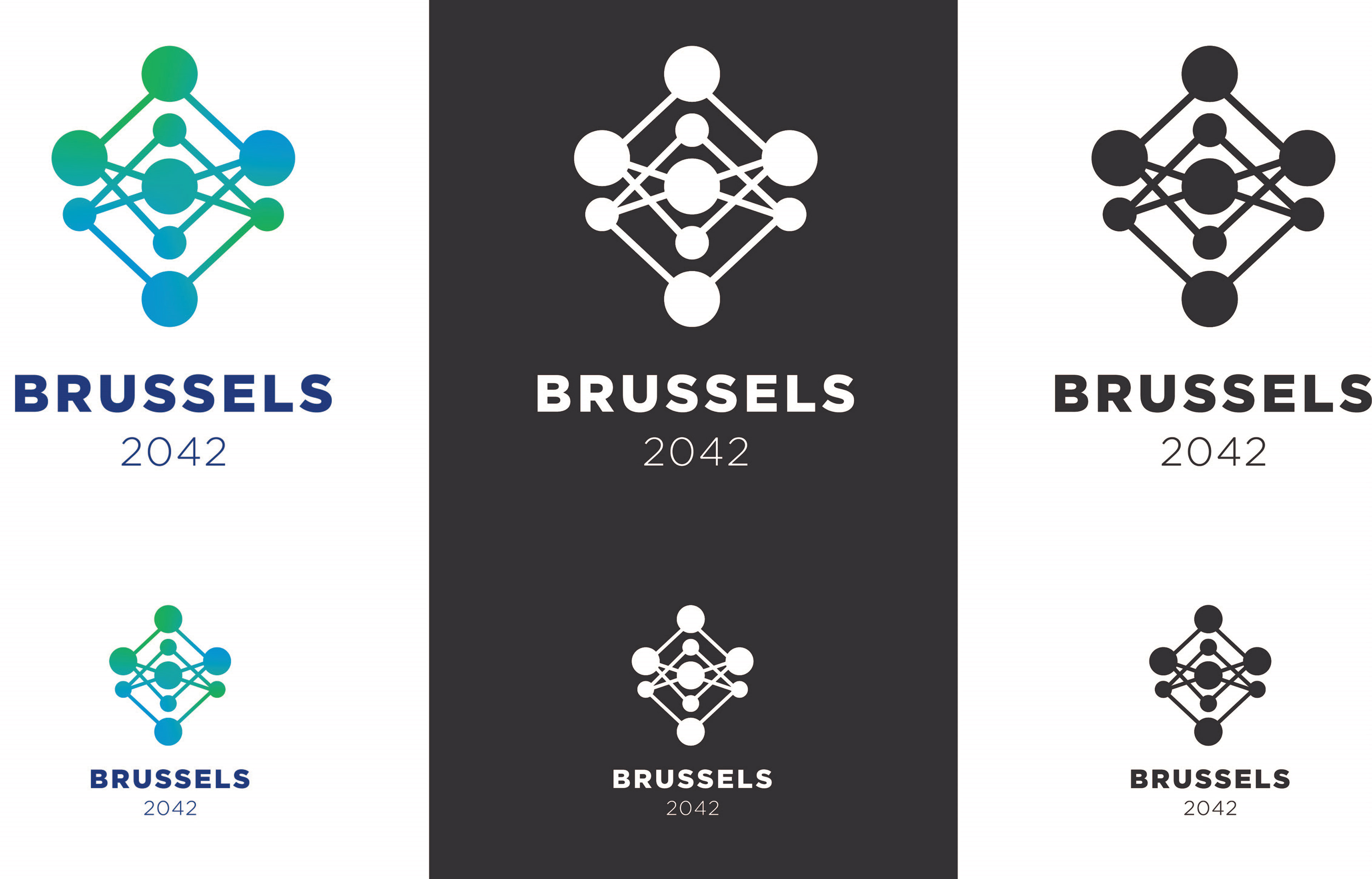
Brussels 2042
The objective of this project was to design an Olympic Bid logo for a given candidate city that successfully represents both the city, Brussels, and the Olympic Games. This project required extensive research about the Olympics, the winter games, and Brussels, Belgium. From the research came brainstorming concept and logo designs.
The inspiration for this logo specifically came from the architectural monument called the Atomium in Brussels. The shape consists of varying sized circles with connecting lines. Looking at the logo abstractly, the form of a capital B may be interpreted representing Brussels or Belgium. The colors chosen within the logo’s form consist of the green and blue from the famous Olympic rings. These colors were chosen because the colors of the Belgium flag consist of the other three ring’s colors, so in the spirit of unity and inclusivity at the root of the Olympics, the logo utilizes the missing colors. The font used here is Gotham with the two weights being Black and Light. Gotham is a grid based font that was designed to be very strong and sturdy in appearance which represents the discipline and strength of the Olympic athletes. Finally, the color of the font is a blue that matches the capitol flag of Brussels. The use of cool colors also emphasizes the time of year for these games, winter.
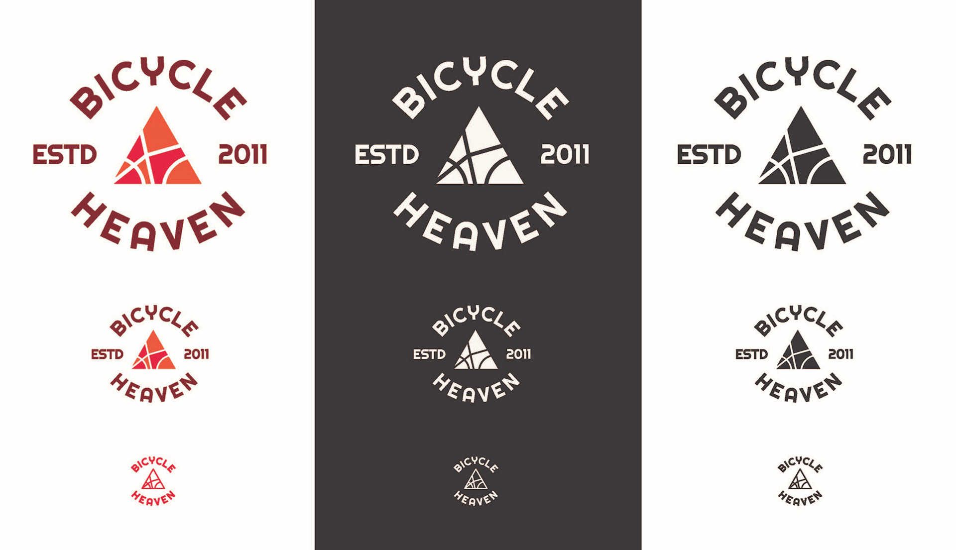
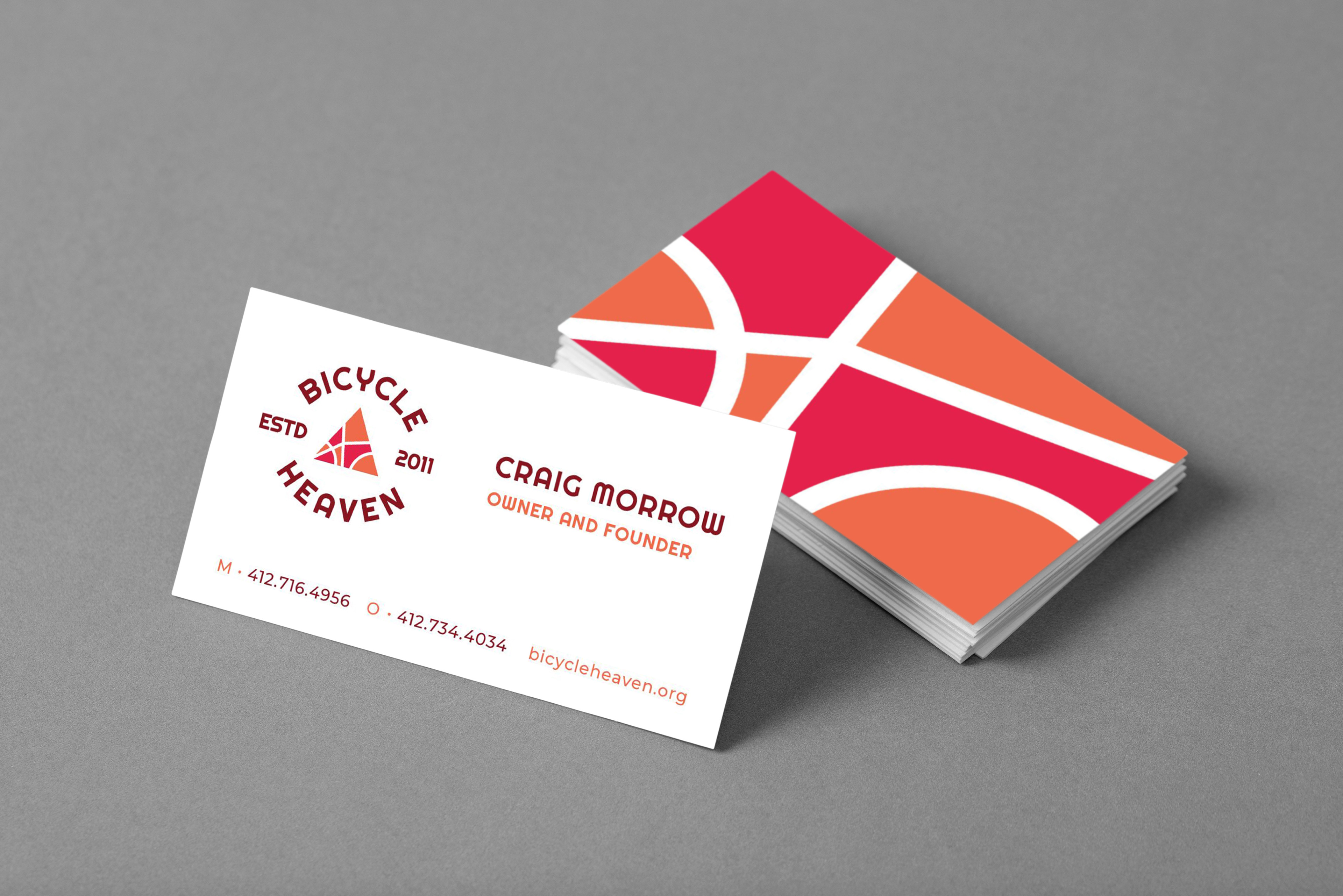
Bicycle Heaven
Note: This brand design was featured in the 19th Annual Chimera Exhibition in Bruce Gallery. Additionally, it was featured in the Chimera XIX: A Progression of Clarity publication.
The objective of this project was to design a new and successful logo for an existing museum. Bicycle Heaven is a museum of bicycles as well as a bike repair and rental shop. The concept behind this abstract logo has multiple fields of thought. The interior lines within the triangle are based on the interior lines and shapes seen in a profile view of a bicycle. Those shapes were placed into a triangle in order to embrace the heavenly aspect of the museum coming from its name. The triangle’s three sides may represent the holy trinity. All together the abstract mark also resembles a stained glass window. The font Righteous was used because of the mechanical like letterforms which bear resemblance to parts of a bicycle, specifically the rounded “C” which appears like a wheel and the “Y” which looks similar to handlebars.
With the logo and the color palette already established for Bicycle Heaven, the stationary and the guide followed in a cohesive manner. The business card and the letterhead were intentionally designed to have a cohesive color system and formatting. The primary information on each is aligned at the bottoms. Each deliverable also includes a cohesive visual element that is intended to reflect the interior lines from the original logo.
Bodhi Gardens
This was a project I worked on through my job with the NWPA Innovation Beehive Network in collaboration with designer Jeff Leretsis. The client was a new non-profit organization in Erie, PA who's mission was to grow and distribute produce to shelters and families in the area. Specifically, they used hydroponic gardens to grow their produce. For their logo, they wanted it to feel organic, modern, and to have a specific tie to the Erie area. To accommodate that request, I used the Presque Isle State Park shape that is very well known in the area as one of the leaves.
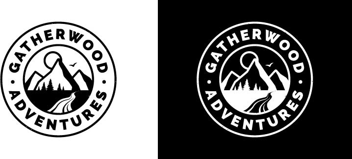
Freelance Logos: Gatherwood Adventures & Cargo Support Services
These projects were both done for real clients via freelance. Gatherwood Adventures was a project that I worked on for a new business focused on empowering young, outdoorsy women, supplying adventure gear and encouraging outdoor excursions. This client was interested in seeing a nature scene in their logo and had an emblem-style design preference. Cargo Support Services was a new business that fixed and provided other support services for commercial cargo planes belonging to companies like UPS, FedEx, Delta, etc. The concept behind this logo was to emphasize the specific market supported by this business. The client wanted a plane in the logo as that was their target business and the gear is used to show the service provided.